
The Creation of The Ned Mural: A Homecoming For Samantha Wood
Written and photographed by Maddie McMurry
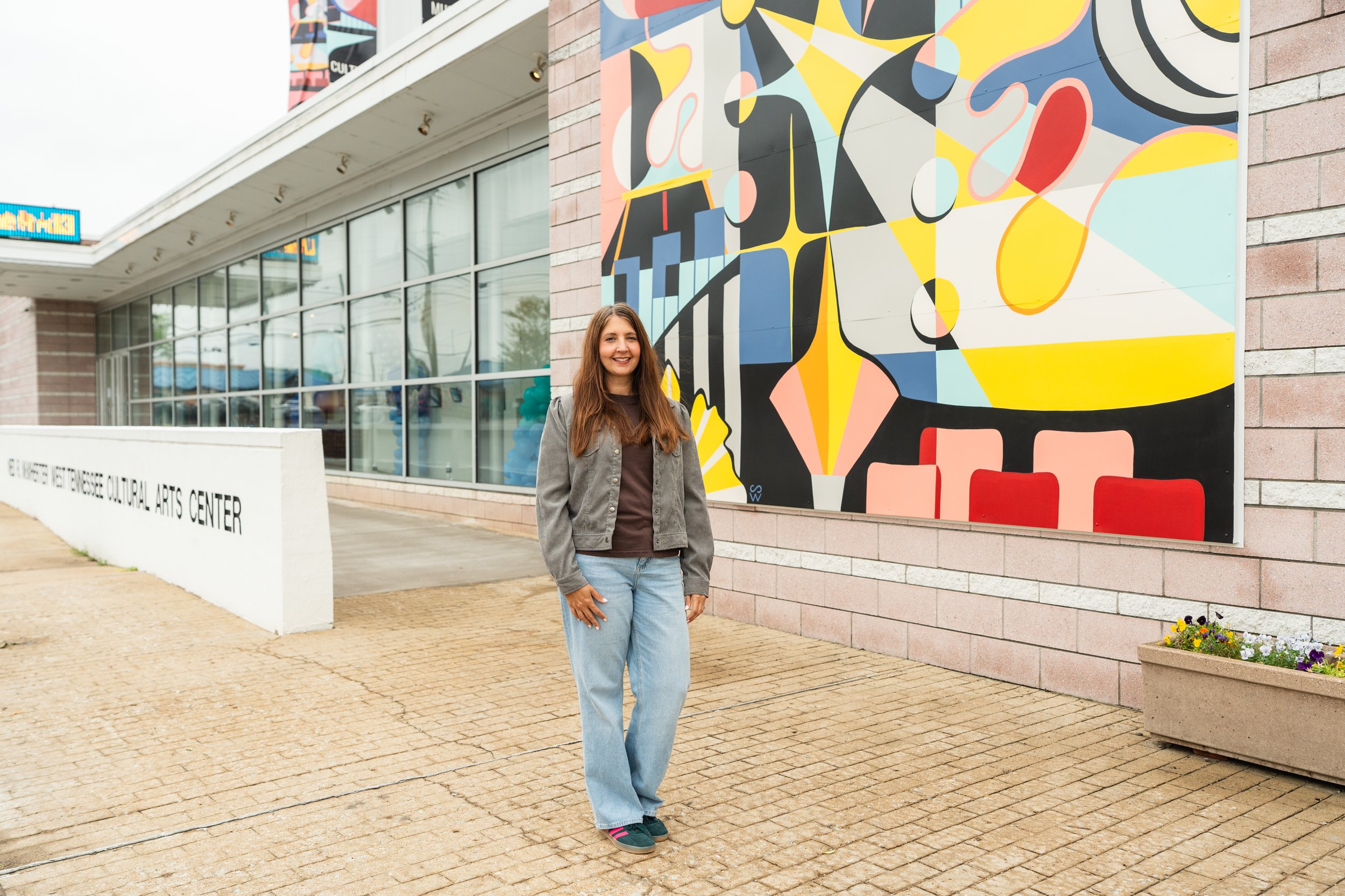
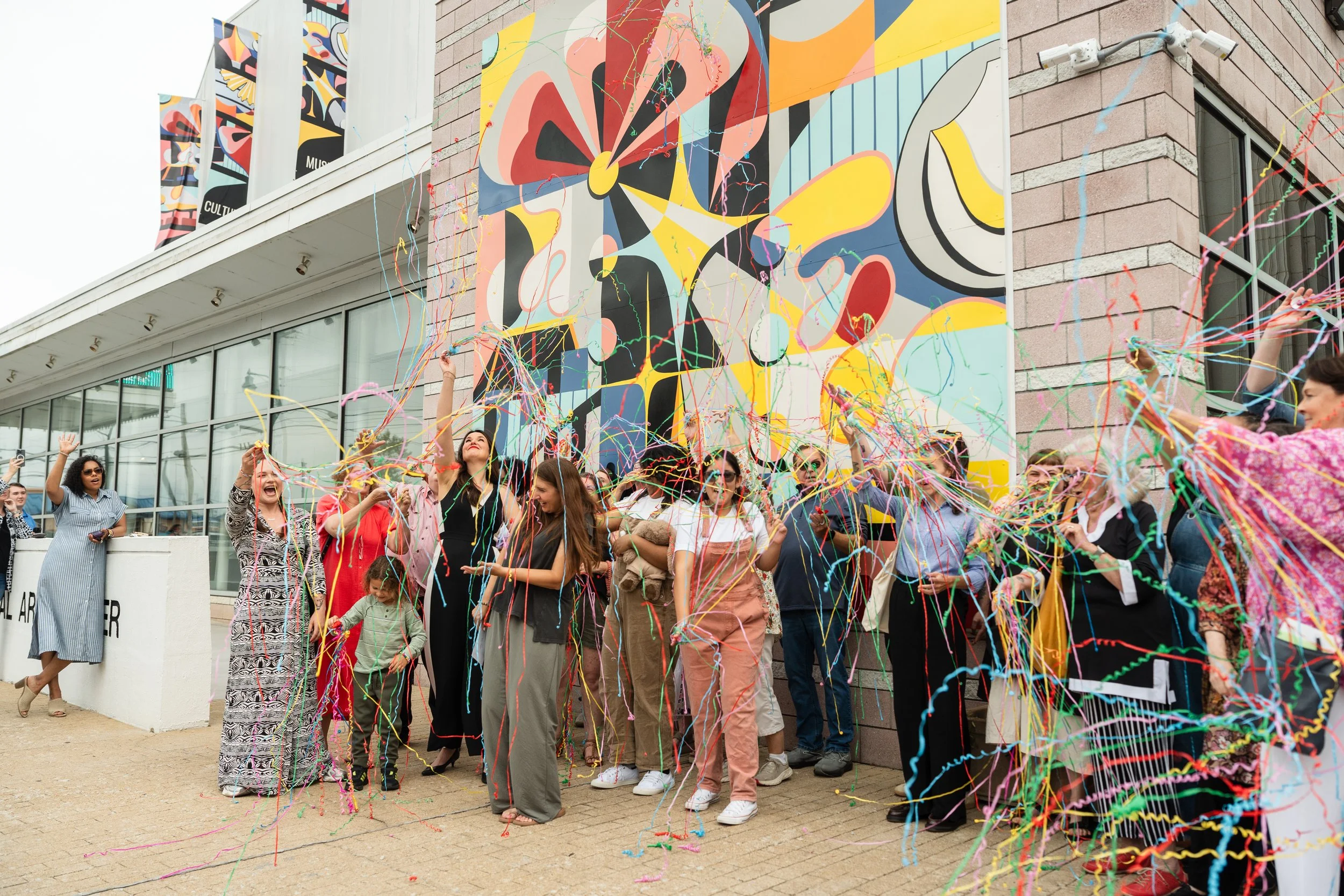
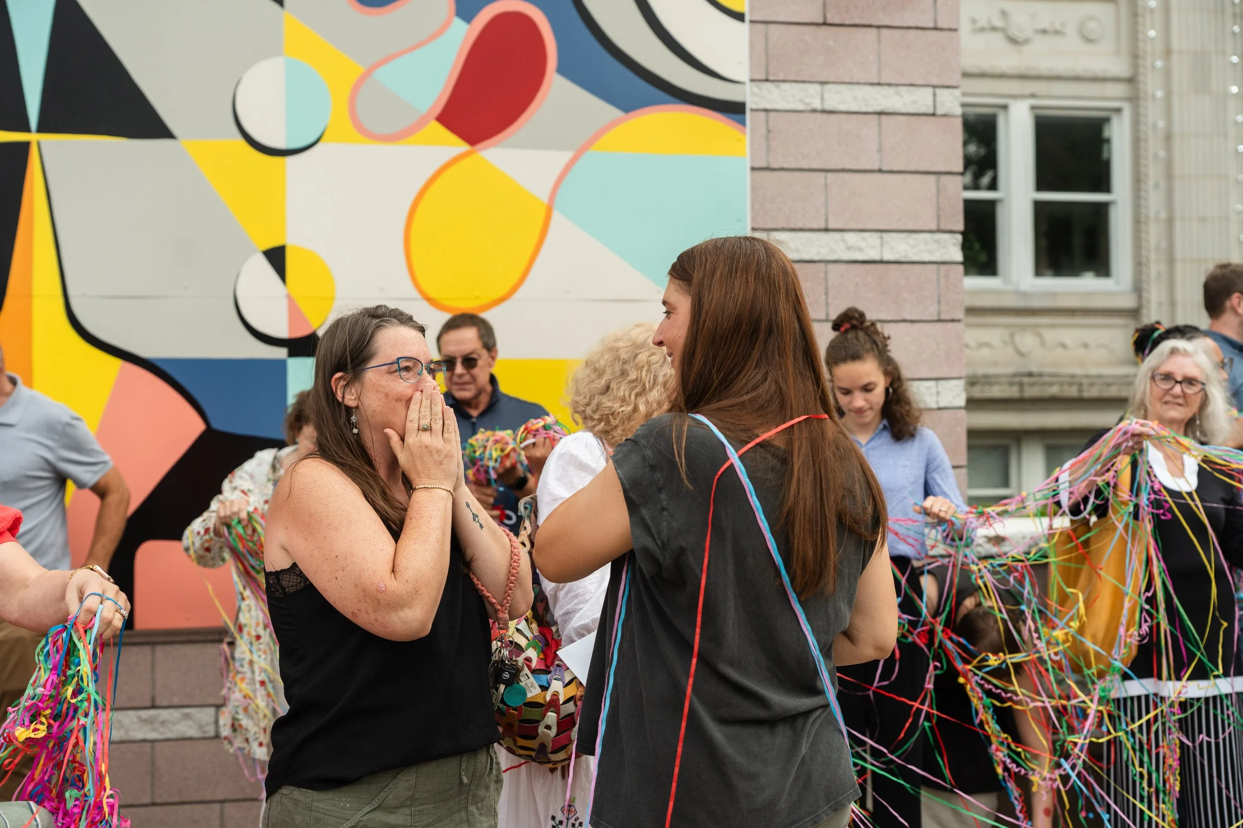
As I was standing at Samatha Wood’s mural reveal last Thursday, I couldn’t help but get a little teary eyed seeing the crowd gather. And I know I wasn’t the only one. People flooded in around the sidewalk in front of The Ned– taking smiley photos in front of the new vibrant colors that are there, talking with Samantha and hearing her passion, supporting the arts, and gathering with the community they love. Mostly, I was teary because this is exactly what Samantha hoped and dreamed of in the creation of this mural. And her vision became a real, tangible reality that the whole city gets to enjoy now.
Samantha’s journey to installing this mural started back when she was an art teacher and wanted to become a full time artist. She called the Ned R. McWherter West Tennessee Cultural Arts Center and asked them if she could have an art show with some of her paintings, which was a terrifying call to make at the time. But that one leap of faith has led to a career as a full-time artist, and now, to installing a mural on the very building that gave her a chance and kick-started her artist career. This mural is more than just a painting, it is a kind of homecoming for Samantha.
“It kind of feels really full circle to now come and get to design the artwork that hangs on the front of it,” Samantha said. “That just feels like a big wow for me."


Prior to this mural, Samantha has done another large project on B3 Creative Agency’s building downtown and has paintings displayed in numerous businesses across Jackson.
Samantha began her design process by simply showing up downtown and observing. She noticed something the old and new sections of the surrounding architecture had in common: their windows.
"If you look to the building at the left, you see the windowpanes there, and then if you stand and look at the older section, you see all the grids on the windows over there," she said. "I thought, by continuing that grid element in the middle, it'll kind of make it feel cohesive."
After establishing that grid framework, Samantha knew she still needed something more. This design was kind of a modern take, and she needed some traditional elements to bring in the old architecture. That's where the rosette and shield shapes came in — details pulled directly from the ornamental embellishments already found on the building's historic architecture.
From there, she layered in details tied directly to The Ned's identity as an arts venue — piano keys, theater seats, stage lighting, curtain ropes, and sweeping curves that echo the building's iconic sign. The piece is even titled “Looking In on the Arts,” and it really serves as a connecting point between the old and the new architecture found on this building.
When I asked Samantha a favorite detail that most people might miss, she pointed to a light fixture with warm, glowing rays. "It just has, like, an Art Deco vibe to me," she said. "I love the warm color palette and the rays and the way it came together." She added that most people won't know it symbolizes the way light shines inside The Ned, but that's part of what makes it special to her.
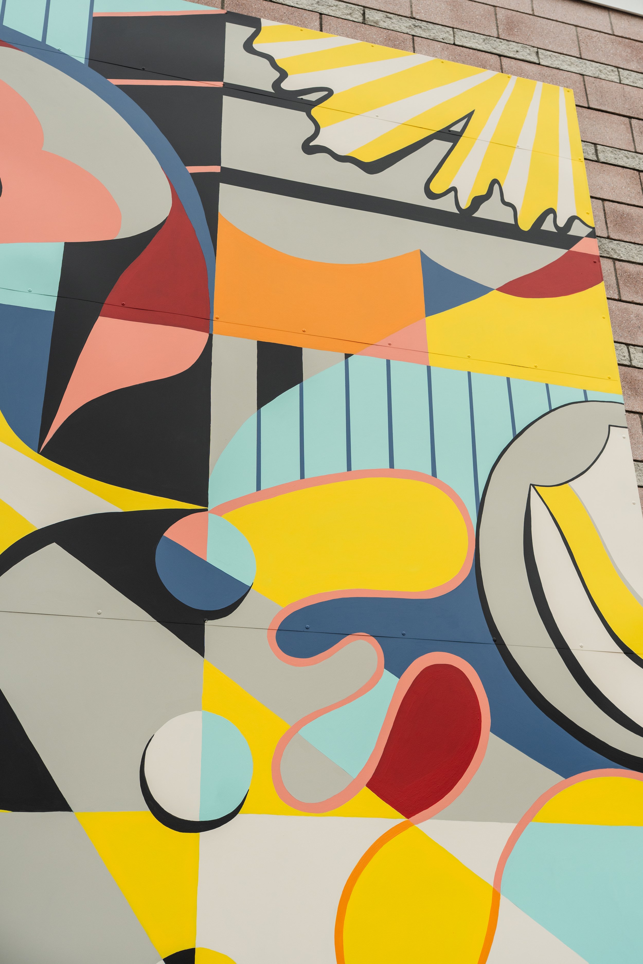

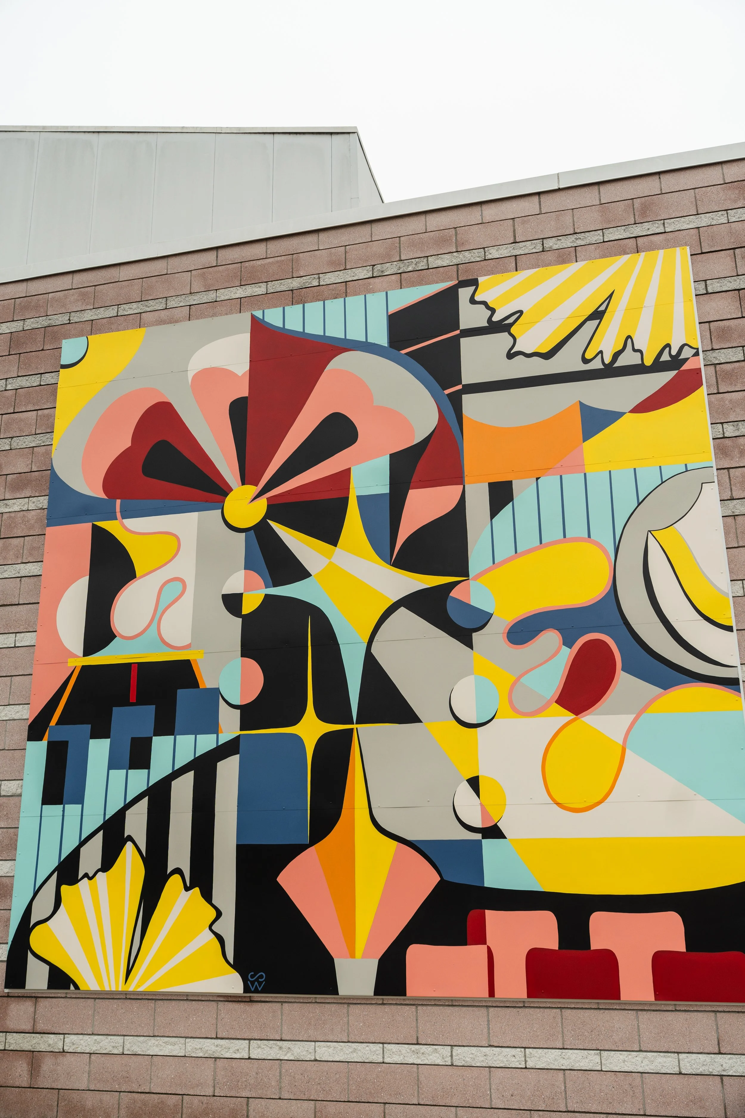
The colors were also carefully considered. Samantha chose the blue and red to complement The Ned's existing signage, and after testing a coral pink sample against the building's brick in person, she found the right balance. Adding gray into the palette helped balance the coral against the brick, and the whole color story ended up feeling natural to the downtown landscape. The bright yellow was a nod to something just around the corner: "I thought about that ginko tree, how vibrant it is in the fall. I was like, I have to have that bright yellow in there."
In the past, this building featured banners at the top, so part of this mural design also included matching banners to display at the top of the building. These came together naturally for Samantha with her grid-based design. Once she had this design, she had nine different squares to work with and mix up different ways to create the four banners. She also painted a full-scale version in her studio before ever touching the wall, which she then took high quality photos of to use in the banners. Plus, it gave her a practice run before installing the large mural. Samantha is a painter at heart, so it only felt right that the banners should have a design painted by hand instead of on a computer.

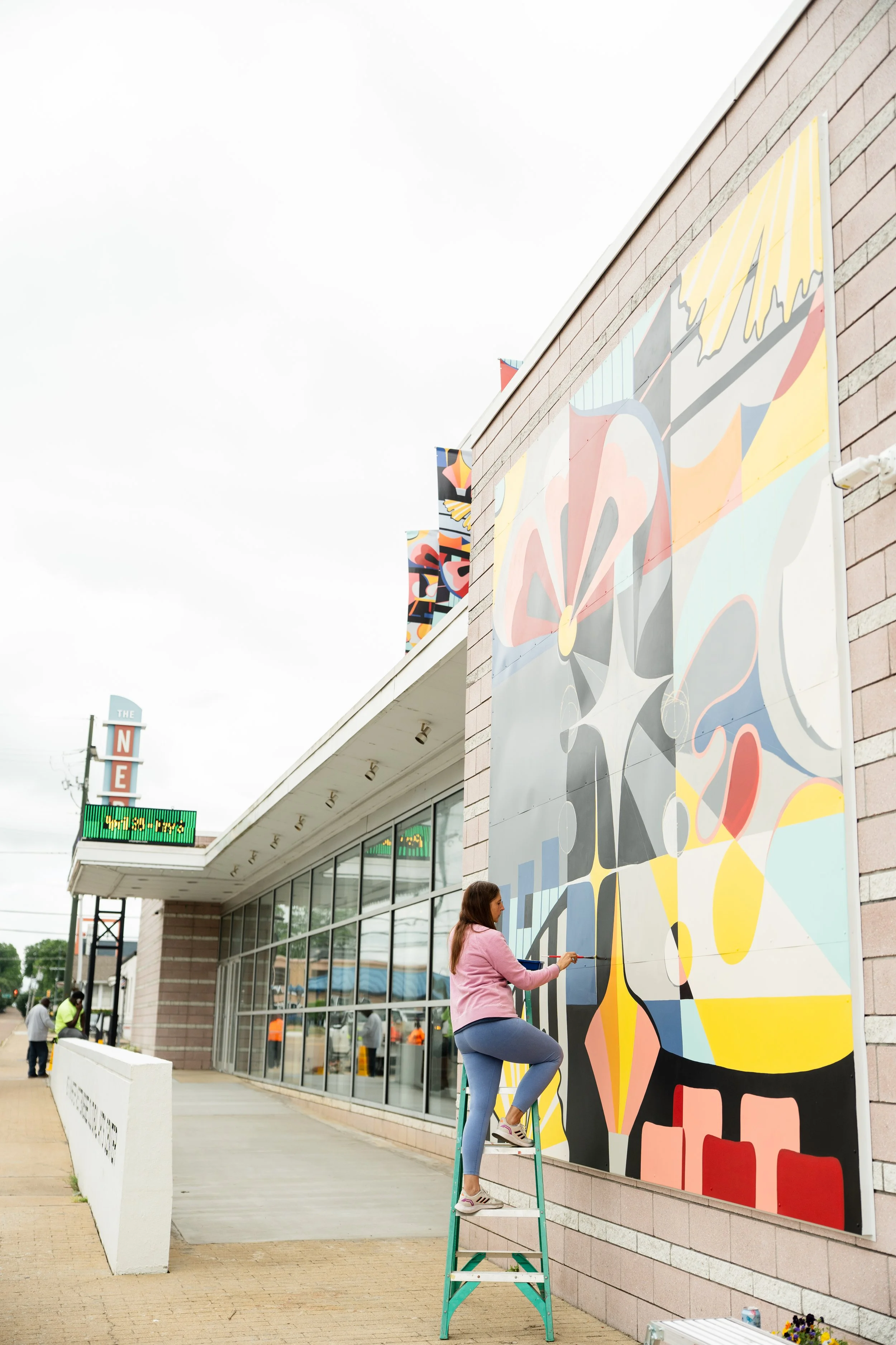
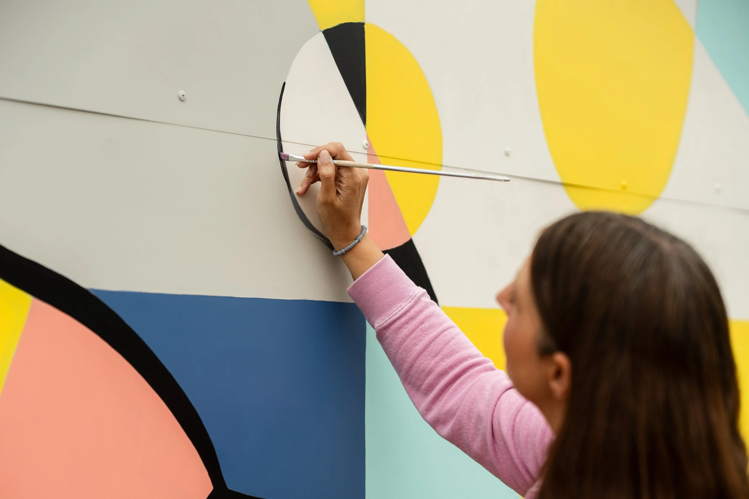
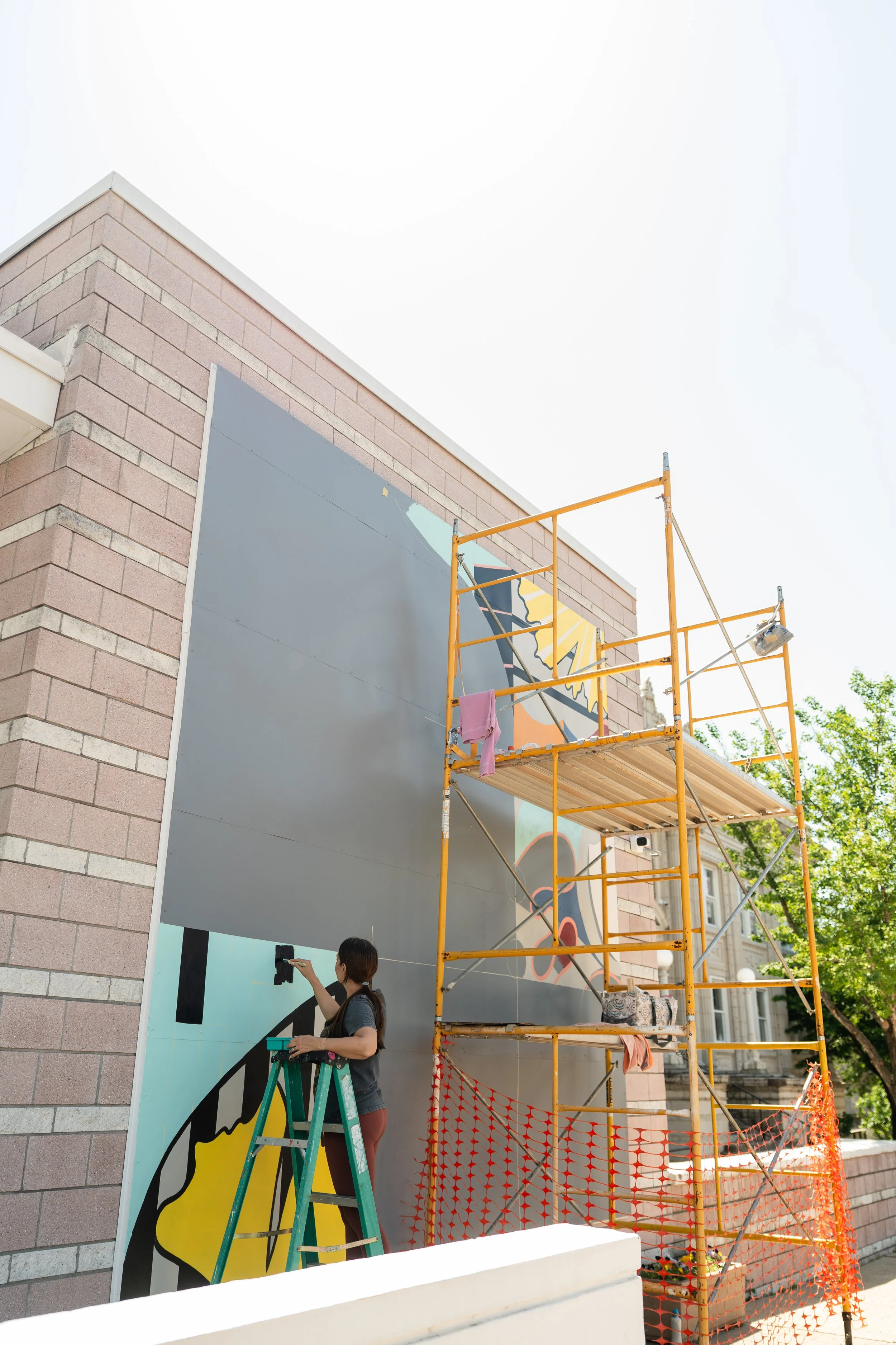
The installation itself came with its own learning curve. This was Samantha's first time painting on metal (yes, this mural was painted on metal panels so the original brick was preserved), and she quickly found that brush strokes show up more noticeably on a flat, smooth surface than on other materials. Weather also played a role — the team had to take down scaffolding ahead of incoming storms more than once. Her husband, Chris, was a huge part of helping put together everything Samantha needed, and as I showed up to document this process in photos, Chris was usually there, right by her side.
"I hope most of all that it just makes people feel good." And she's already heard that it does. "I've already had a couple of people comment that it just feels like this was meant to be here — and I feel like that's the biggest compliment."
Samantha’s work is truly a mural rooted in so much intentional detail that, ultimately, it just feels like it belongs. Stop by and check it out at 314 E. Main St. and support Samantha Wood’s art on her website.